4 Tricks to Improve Lead Conversion on Your Landing Pages

Of the many components that go into inbound marketing, it is easy to overlook the seemingly simple form on your landing pages. After all, it takes just minutes to create, compared to the hours spent researching, writing and designing content such as case studies and webinars.
But if the landing page form turns visitors off, you lose the opportunity to convert them into a lead with your great content.
Take just a minute to review your landing pages, and put these little tricks to work to improve your landing pages’ conversion rate.
1. The right form length
How much information should you ask for on a landing page? There is no one right answer, beyond saying you should ask for the least information possible to meet your lead nurturing needs.
Basically, fewer fields means a less intimidating form, but you also need enough information about your new lead to effectively nurture them and continue to provide relevant information. Offers that are at the top of the sales funnel — informative awareness stage materials such as a blog subscription or introductory ebook — should ask for less information. That could mean just a name and email address, allowing you to personalize future emails, but without asking for more than the visitor is willing to provide.
Materials and offers designed for prospects who are closer to a buying decision, such as product price sheets or demos, may require more fields, such as job title, company name or industry. This information will help your marketing and sales staff to qualify leads and to present the most relevant information in follow-up discussions online, on the phone or in person.
Landing page form trick: Make it appear shorter
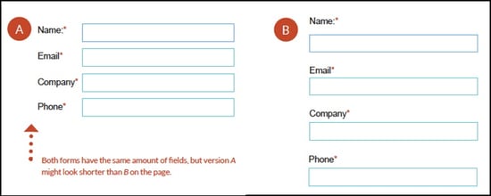
Sometimes, even if you feel you need more fields to collect essential information from your leads, you can reduce how intimidating the form looks simply by reducing the spacing between fields.
Aligning field titles to the left, rather than above the individual fields, can also reduce the apparently length of the form.

2. The right pre-filled fields
We just talked about not asking for more information than is really needed, depending on where in the sales funnel the offer in question falls. You also need to consider whether you are asking leads (repeat visitors) to fill in the same fields over and over again.
Landing page form trick: Use progressive profiles for repeat visitors
By using dynamic content on your website, your site can remember what information a visitor has provided in the past. There is no reason to ask them to type it all in the next time they access one of your offers.
Your landing page forms should be set to prefill fields that specific leads have already completed, so they only need to type in the answers for fields that are new as they move through the sales funnel from awareness to consideration to purchase intent.
3. The right button
What does the button on your landing page look like? Is it easy to see and find? You may want to use a contrasting color that lets the button stand out, so that it isn’t overlooked. Make it look like a button (possibly with a 3D effect or beveled edges) so your visitors know that it is meant to be clicked.
Also be sure the button is located in a location that makes sense. I use an online forum occasionally where the button for sending a message is located at the top of the window, rather than below (which is where a “cancel” button is located), and have frequently typed a message only to click the cancel button without thinking, losing all of my work. Don’t let that happen on your landing pages.
What does the button on your landing page say? The default is often “Submit” — as in “submit this form.” But that isn’t exactly a positive word to most people.
Landing page form trick: Sell the benefit and make it action-oriented
While a single word or phrase may not seem like a big deal, the impression given by the button on your landing page form is still an extension of your company’s brand and what you want visitors to know or feel about you. So rather than asking them to “submit,” create a button with phrasing that projects both action and benefit. “Download ebook” is OK, but what about being even more direct and positive:
-
Start saving now
-
Do your job better
-
Win more sales
-
Join a winning team
4. The right level of trust
While we have all become accustomed to signing up and signing in on dozens of websites every day, giving our email address, name, and sometimes even more information. But it is still a good practice to make your website visitors feel comfortable that the information they are giving you won’t be misused.
Landing page form trick: Provide privacy and security assurances
There are a number of elements you can add to your form or landing page to help reduce a visitor’s concerns about providing information. One of the simplest is a privacy message stating that their information will not be shared or sold. If your privacy policy is a bit more complicated, add a link to the webpage that spells out the details.
You can also, when requesting more sensitive information, include security seals or certifications so that visitors know their information is safe and secure.
Another way to increase trust is by using customer testimonials about your product or service —especially if you can combine with them your customers’ photos or recognized logos—as social proof.
Fine tuning your landing page forms is just one way to increase your lead generation. There are 30 great tips and tricks for generating leads online in our free ebook: 30 Greatest Lead Generation Tips, Tricks and Ideas. Download it now, and tell use which ones you like best.
-1.png?width=1652&height=294&name=Jones(RGB)-1.png)


