
Throughout its 20-year history, Viiz has provided robust technology, cutting-edge innovation and a human touch in moments that matter most. Yet its previous brand, messaging and website fell behind in reflecting the company’s evolution, innovation and market expansion.
Here’s an inside look at this successful B2B tech rebrand:
Working with JONES during a six-month period, B2B technology company Viiz revamped its messaging and positioning, visual imagery and launched a rebrand and new website to more accurately convey what it offers, while ensuring it stands out from the competition as a leader in mobilizing data and people to solve problems and provide excellent service and support.
Developing Messaging for Market Expansion
Prior to working with JONES, the company’s messaging and content was minimal — a website and product sheets — and outdated. It did not reflect the company’s expansion into the IoT markets for Emergency Services and Customer Care.
Over a series of meetings with Viiz’s executive team, the JONES team took a deep dive into learning about the company’s three primary markets, the technology and human resources that drive modern, cloud-based communications, and the future direction of the company, said Esther Chapman, senior director of content for JONES.
“Viiz has developed a robust, cloud-based network over many years in the industry, and even more can be done today with data available through the Internet of Things,” she said. “The goal in developing new messaging and positioning was to give them a power boost to go beyond small, customized markets and traditional telecom into the fast-growing, IoT-driven markets shaping the future.”
The “sprint,” as we think of those initial meetings, involves asking dozens of questions that help JONES pinpoint the right messages for clients while developing a narrative for effectively engaging new audiences. JONES builds a full understanding of the target market, customer pain points, common objections, industry trends, company goals and, of course, how the company’s services work.
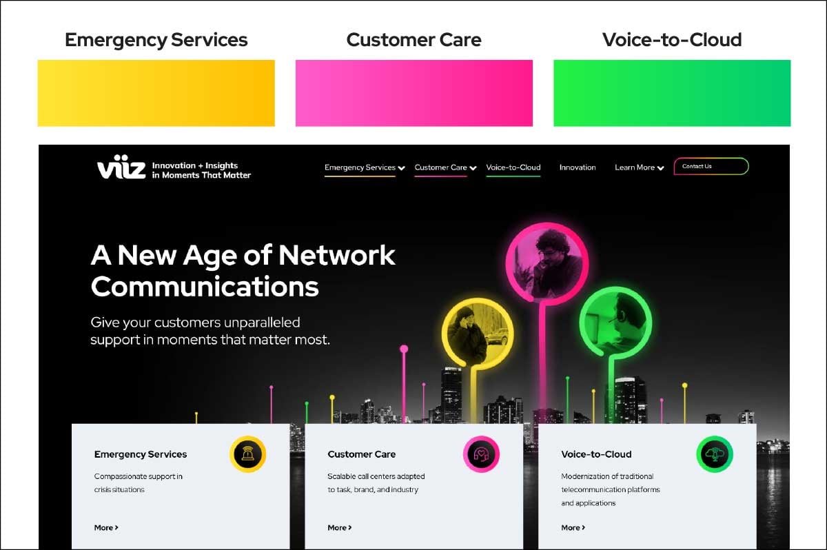
Viiz specializes in three areas of network communications: emergency services, customer care and voice-to-cloud services. The company is unique in pairing the most cutting-edge technology and IoT data integration with either automated or live support, depending on what is necessary at that moment. In emergency situations or when a customer need is nuanced or complex, Viiz’s highly trained customer service agents can access all forms of data to provide a level of support not possible through automation alone.
Because of this data-enriched customer support model, the JONES and Viiz teams unanimously settled on an overarching theme of “Moments That Matter.” The subsequent Messaging and Positioning document set a foundation for the company’s new website copy, as well as executive messaging for speeches and LinkedIn profiles.
Chapman and the JONES team also helped the company refine the narrative around its unique name and spelling: Viiz.
“Our team always makes the effort to truly understand both the client’s company and the markets that hold the most potential for its products and services,” she said. “We ask insightful questions that get to the heart of the technology, its customers, the executives’ vision for the future and the stories we need to tell.”
Defining the Visual Brand
At the same time the sprint meetings were taking place, JONES conducted a brand audit of competitors, reviewing both their messaging and visual brand elements.
“Capturing key headlines, in particular, helped provide a window into what competitors are saying about themselves, how they view themselves and how they are communicating those messages to their users,” said Scott Muff, JONES co-founder and COO.
Understanding those elements helped ensure Viiz wasn’t missing important conversations in the market, and that the new messaging would be differentiated, rather than duplicative of another company’s approach.
The brand audit not only looked at the verbiage used by Viiz’s competitors, but also compared competitors’ visual branding.
“One thing that stuck out was that almost every single website used the exact same colors,” Muff said.
That insight revealed an excellent opportunity for the JONES design team to create a visual identity that would stand out from the crowd.
Coupling the information from the brand audit and the messaging and positioning document, the JONES design team next zeroed in on phrases that could provide inspiration for the visual identity. In addition to “moments that matter,” those phrases included: “IoT-informed” “data + human support,” “data-enriched customer support” and “customizable solutions.” Those key phrases sparked concepts for the three initial mood boards, complete with graphic elements, colors, typography, image rules and sample designs.
“In the mood boards, we play out what that might look and feel like,” says Wendy Bierbaum, partner in charge of creative services for JONES. “It’s a lot of exploration of colors and feel.”
After consultation with Viiz representatives, the three mood boards were narrowed down to a final choice, with modifications. Elements that became key to the company’s new visual identity included:
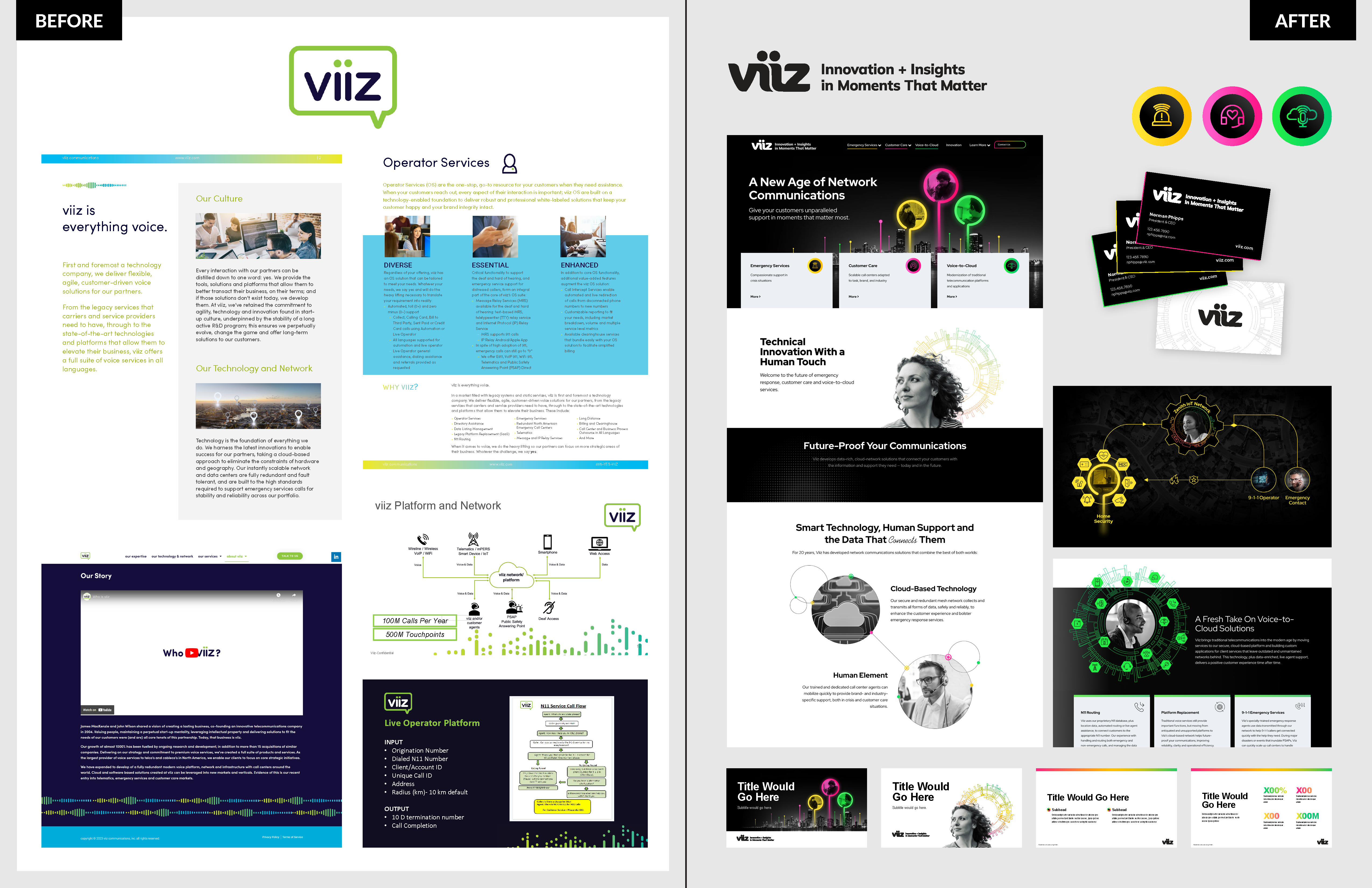
Three bold colors — Bright, nearly neon colors, each representing one of the company’s three verticals, offer unexpected accents for the website and other content, setting it apart from the competition.
Circles and lines — These elements reflect the technology-driven aspects of the company.
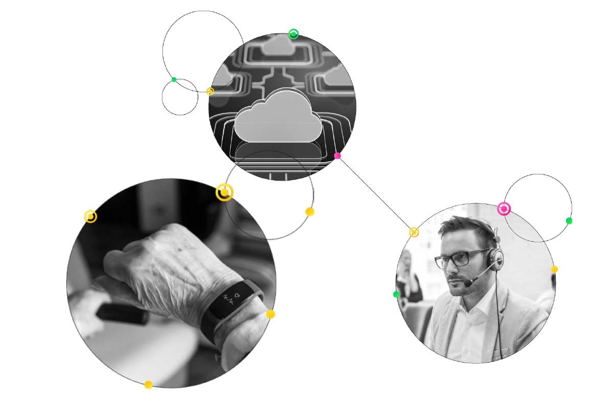
People with technology backdrop — Because the human-plus-data element is a strong part of what differentiates Viiz, images of people have a graphic representation of data behind them to depict the strength of humans supported by the data that they need.

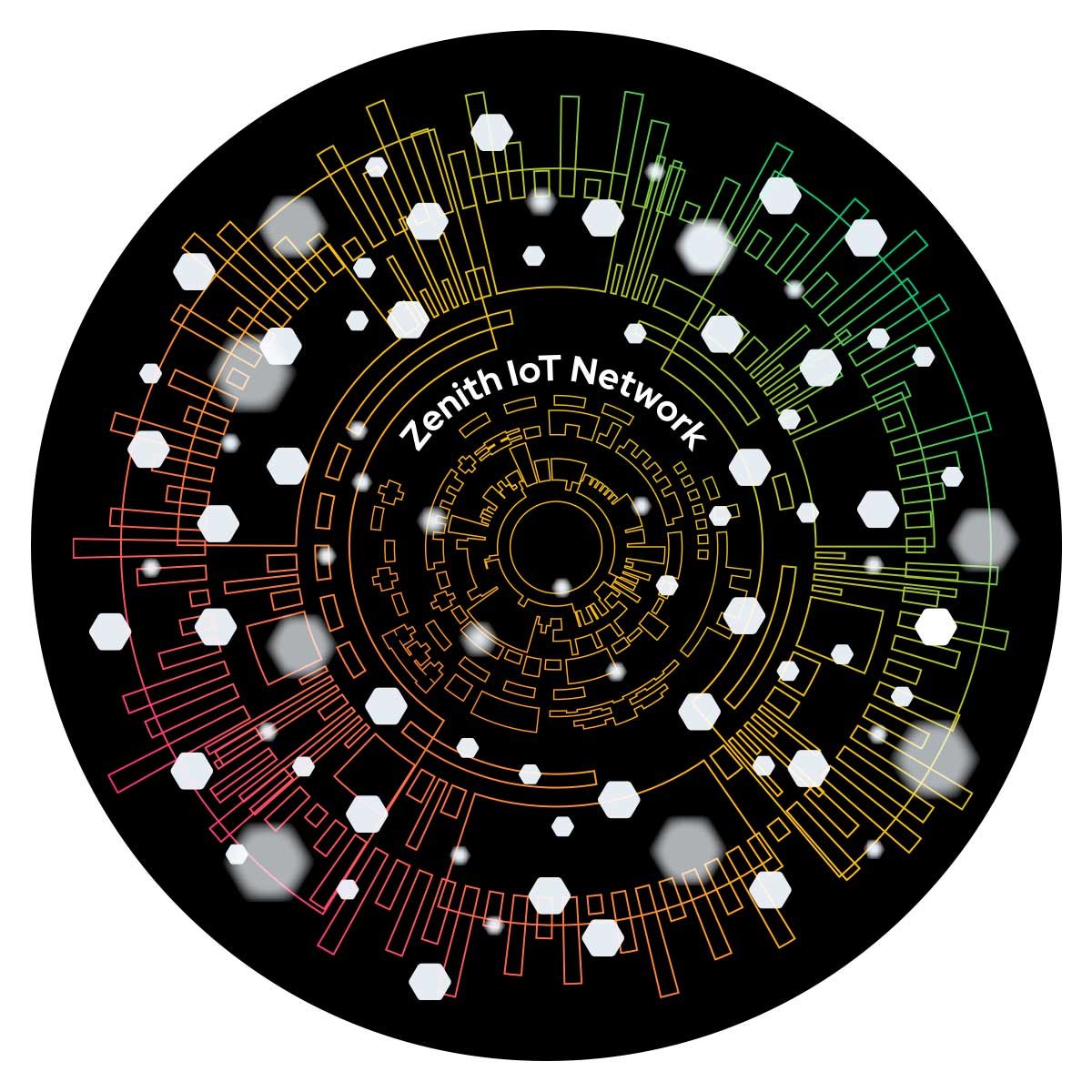
Zenith IoT Network — Viiz uses its cloud-based Zenith network to collect and transport all forms of data, so this was an important element to visually represent on the company website in explaining how the services work. (We also named it - do you like the name? We do!)
These elements can be seen throughout the company’s website. On the mostly grayscale background, the bright colors draw attention to each market. “We wanted to show that we can handle all of the different verticals but we know that there is a difference between what each one needs,” said Bierbaum.
Another important design element on the website is a series of “how it works” diagrams, providing a visual story of how the company’s technology connects users and their data — whether from security systems, medical alert wearables, mobility devices or traditional voice calls — with the support they need.
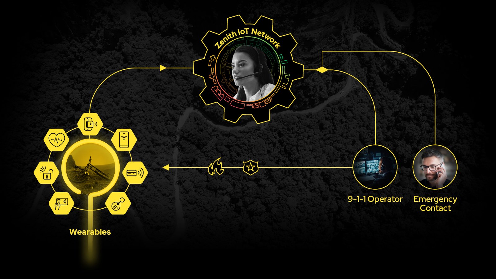
The diagrams feature animation on the website and are ready to be used in additional content as well.
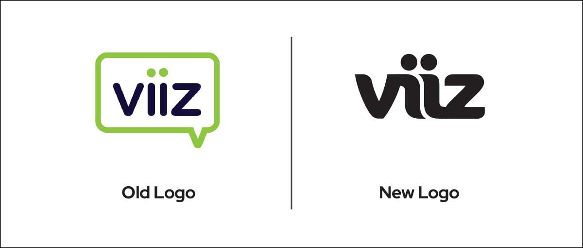
The JONES design team also refreshed the company’s logo with a bolder and more refined version of its previous one, using the two lowercase letters in the center in a way that brings to mind connections and people.
“We worked to capture the energy and vibrancy that drive Viiz’s innovation. Our goal was to make it easier for the company to communicate to current and prospective clients what Viiz can do and where it is going, and we accomplished that in spades,” Muff said.
Creating a Website for the Future
Prior to working with JONES, the Viiz website focused on the traditional telecom market (“everything voice”), which had been the company’s bread and butter for years. The company had evolved to serve other emerging markets, but the website lagged behind that transformation. JONES helped the company rethink its website from the ground up starting with a sitemap, a flow chart that illustrates how pages within the site will connect, including the top menu bar, footer, and individual service lines.
“Having a sitemap specifies which sections we need and how they fit together, which reduces copy revisions later because we are all on the same page,” said Muff.
The next phase was wireframes, which show placement of text and graphic elements. Wireframes help writers create website copy that works with the design and stays on-point, adhering to the types of headings and word counts indicated. Chapman says the copy was written in short, easily digestible sections to make it easy to understand while keeping the website visitor engaged.
Muff says that while clients may want to jump straight into full-fledged design, it is essential to take the intermediary steps of developing the sitemap and wireframes to guide the design and the copy development. Having those guides in place provides the combination of consistency and creativity needed for a great website.
The new website combined Viiz’s updated messaging and imagery to more fully portray its innovative technology and ability to serve the Emergency Services and Customer Care markets. The vibrant, comprehensive graphics provided information that customers needed to differentiate Viiz in the market, highlighting the company’s unique combination of IoT technology and a human element.
Laying the Groundwork for Future Success
Because Viiz was already using some HubSpot solutions for its sales initiatives, it made sense to build the website on HubSpot’s platform, though JONES also uses WordPress for web development.
“One of the things we really like with HubSpot is the ability to track everything in one place,” Muff said.
HubSpot can track data such as an individual’s interaction with a website and specific CTA buttons, and then integrate those analytics into its platform. It also allows for the capture of contact information, which can be directly integrated into the CRM. It incorporates content management and marketing automation into tasks to create workflows and email sequences for content marketing campaigns.
Muff wanted to make sure subsequent edits and copy changes would be manageable for Viiz’s in-house staff.
“With HubSpot, they don’t have to rely on a developer to go in and change the website for minor tweaks,” he said. “Clients who are more advanced users can even build their own webpages to expand the site.”
JONES optimized the new site for SEO with meta tags on all pages and descriptive alt text that incorporates the company’s targeted keywords. The site is built to meet accessibility standards and to render correctly across all platforms, desktop and mobile.
The key to SEO going forward is new content, which is why JONES provided Viiz with prebuilt modules for use in the future if the company develops a blog to provide that new content.
“As part of our planning process, we talked about what their plans are and how they want to use the website, and then we offered them advice about how they should use it,” he said. “We want to plan ahead six months or a year from now, so our clients get what works for them now and into the future.”
Finally, JONES left Viiz with a 12-month plan of marketing recommendations, a best practices outline of how the company could continue the momentum built through their new brand visuals, messaging and website.
“You can build a great website, but it is only one portion of the information your customers are looking for,” Muff said. “It is what comes afterward that is really going to close the sale. It is the collaterals, blogs, emails and digital marketing that drive people back to that website to the resource center, to the newsroom, where they can find more information that leads to a conversion.”
JONES is dedicated to helping clients launch into the next stage of growth and success. Let's talk if you are a VP of marketing, CMO or startup founder and ready to take that next step. Schedule a no-cost, no-obligation consultation, by accessing my calendar here.