
By definition, a "call-to-action" is a call - it is there to get attention and generate action. One of the keys to doing so is to make your call-to-action stand out with strong, contrasting colors. Carelogger found that they increased their CTA conversions by 34% just by switching from a green button to a red one. (Click to tweet!)
Size matters, too. Your CTA button needs to be big enough to be noticed. HubSpot has found that a good button size for CTAs is 225px wide and 45 px high. (Click to tweet!)
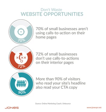
Our advice: When designing your CTAs, make sure they can be found on the page. Let them call out; whispers are easy to ignore. Follow these two tricks for great calls-to-action and see results!
Put more best practices to use in designing your calls-to-action with our free ebook download: The Comprehensive Guide to Designing & Executing Calls-To-Action.