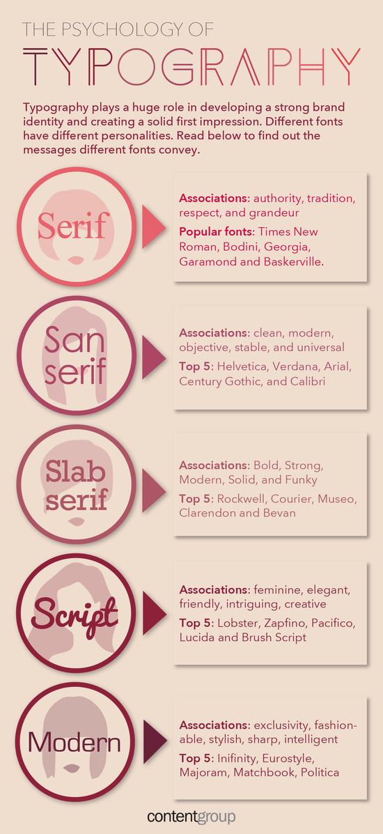
Branding Strategies: Choosing Colors & Fonts (infographics)

I know we’ve said it many times: A logo is not a brand. And neither is a combination of colors and typography the same as a brand.
A brand position is something more: A feeling, an approach, an understanding of what your company does, and is, and stands for.
That said, the colors and typography you choose as part of your branding strategy go a long way toward portraying that feeling you are going for.
Check out the infographics below for a look at the deeper meanings and the emotions evoked by your color and font choices.
What do you think? Is your current imagery fitting for the brand position your company wants to portray?
Tell us about brand imagery you have run across that just didn’t seem to fit — share examples in the comments.
And if you are considering reimagining your brand—logo, other elements, or entire positioning—check out our Six Steps to Creating Enviable Brands for the process and guidelines JONES follows when we develop branding strategies.


