
Calls-to-action (CTAs) are one of the four essential elements of lead generation. They are the eye-catching, action-triggering “buttons” that bring your potential leads to a landing page to access an offer.
1. Effective CTAs make the offer clear.
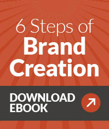
No one is going to click on a CTA if they aren’t sure what is being offered. Is there any question what you are going to get if you click on this call-to-action?

2. Effective CTAs are action-oriented.
Just as you want to be clear about what the offer is (e.g. a coupon), you need to be equally clear about what action the visitor will take on the landing page to access that offer (Will they download the coupon? Will they enter their mailing address for a paper coupon or sample?).
This is where active verbs come in: Join. Subscribe. Download. Save. Try. Watch. Sign up. Learn. Give. Find. Go.
3. Effective CTAs are above the fold?
While there is some debate amongst web designers about whether “the fold” is still a concern in this age of varied screen sizes and users accustomed to scrolling to find the rest of what they are viewing, Nielsen Norman Group says the average difference in how users treat info above the fold vs. below the fold is 84 percent. That means many website visitors will never scroll down the page, especially if they haven’t been given a reason to do so. If your CTA isn’t in the first section of the webpage, they won’t see it.
4. Effective CTAs stand out.
Again, if they aren’t seen or noticed, your visitors can’t act on them. Calls-to-action will stand out more if they are in a different color scheme than the rest of the page, or if they have plenty of whitespace around them.
This bright red CTA on Liquid Light’s webpage is hard to miss against the blue background.

5. Effective CTAs are consistent with the landing page.
Using the same language in both the call-to-action and the landing page copy will reassure your visitor that they have arrived at the correct destination. CTA copy should match the headlines on your landing page and use the same verbs. Also use the same image in both the CTA and the landing page to maintain consistency.
6. An effective CTA strategy includes calls-to-action for different stages of the buying cycle.
Remember that while new visitors to your web page may be attracted to a CTA for a blog subscription or a webinar, you may have returning visitors or leads who will click on a CTA offering a consultation or free trial. Just as you create offers for all stages of the sales funnel, use corresponding CTAs to promote those offers.
7. An effective CTA strategy includes CTAs on every page of your website.
Each page should have at least one CTA that is relevant to that page, whether it is a “Subscribe now” CTA on your blog’s home page, an offer for an ebook that goes into more detail about the topic of a specific blog post, or an offer for a free trial on a product description page.
Your homepage should include at least two CTAs.
Of course, calls-to-action shouldn’t be limited to your website. Check out the other 10 places you should be using CTAs.
So, how effective is your call-to-action strategy? Give yourself and your staff an objective grade by using our CTA Report Card template as a reminder and evaluation tool.