
Sometimes, it really does pay to sweat the small stuff.
Small stuff includes the little details on your landing pages. And you sweat the small stuff because small changes can have big results, like a 30-40 percent increase in lead generation for B2B companies.
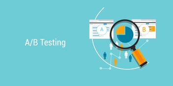
The way you find out which small changes will yield those big results is through A/B, or split, testing, which randomly applies two versions of a single element to your landing page, or email, or CTA, to determine which generates the best results.
Here’s a primer on how it works: Do You Prefer ‘A’ or ‘B’? Use Testing to Improve Marketing.
While you can use split tests to compare elements of a wide range of marketing tactics, landing pages alone present at least 15 different opportunities to test the little details and find out which ones improve your conversion rate. (Click to Tweet)
Want to take a big-picture approach to landing pages instead? See how they fit into your overall marketing strategy in How to Optimize Landing Pages for Conversions.
Use A/B Tests To Optimize These Landing Page Elements
1. Landing page layout
Did we just say these tests are about the tiny details? As with any rule there are exceptions. You can test your landing pages in a “big” way, too, by testing the overall layout of the pages.
Try testing two versions with different placement of major elements: should the form be on the left or the right? Where is the best place for the image or the headline?
Once you’ve settled on a layout, at least for now, then fine tune individual page elements with additional tests that change only one thing at a time.
2. Landing page headline
Find out if a short, punchy headline performs better or if your visitors respond to a more descriptive headline. Does it make a difference if you use an imperative command in the headline?
3. Copy and headline font size
Should your headline be bigger to grab attention? Is it better to have your body copy slightly smaller so it doesn’t seem like too much to read?
4. Landing page image
Do visitors respond more to an image with a person, or an image of the content offer? Try two different images to see if it influences your landing page’s conversion rate.
5. Captions on images
Does adding a caption to your landing page image provide useful information, or it is distracting people from the purpose of the page: filling out the form?
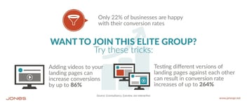
6. Use of video on landing page
Does a video explaining the offer entice more visitors to fill out your landing page form?
7. Use of social follow buttons
Does including social follow buttons on the landing page generate more followers for your social media platforms? Or does it take visitors away from the landing page before they can complete the form?
8. Use of testimonials
Do your visitors convert more often when the landing page includes a customer testimonial? Compare results with the testimonial in different locations on the page layout, or for different types of offers.
9. Use of third-party seals of approval
Does adding a VeriSign seal or a Better Business Bureau seal of approval make people more comfortable submitting their information to you?
10. Landing page form field names
Are the labels on your form fields confusing prospects? Could you use clearer terms that don’t distract them from completing the form?
11. Number of landing page form fields
How many form fields are your prospects willing to complete to obtain the offer? If you add, or subtract, a field, will it influence your conversion rate? Use these tests to maximize the information you gather to assist in qualifying a lead without jeopardizing your lead generation efforts.
12. Color of the landing page form button
Is it better to make the button a color that contrasts with the rest of the color scheme on your landing page? Or is that too jarring, and the results are better with a color that blends into the page?
13. Size of the landing page form button
Is your landing page form button too small for prospects to find easily to complete the form? Or is it too large and distracting, taking attention away from your copy that explains the offer?
14. Landing page form button copy
Will more people convert to leads when the button copy uses a more generic term such as “submit” or “download,” or do you get better response from more dynamic, actionable words such as “Start Growing” or “Transform Your Meetings.”
15. Landing page form headline
Even the headline above your landing page form can be tested. Does your conversion rate change when you use an action-oriented headline (“Get your ebook now!”) compared to a benefit-oriented headline (“I’m ready to close more sales.”)?
Whew. That sounds like a lot of elements to test for a single, simple landing page, doesn’t it? But landing pages are at the heart of your inbound marketing efforts — it is there that your visitors make that transition from an anonymous ISP number connecting to your website into a lead, with a name, contact information and other vital information that you can use to nurture them and potentially reach another conversion point that turns them into customers.
If you want your landing pages to do their job more effectively, it pays to sweat the small stuff. And you’ll find all of that small stuff in How to Optimize Landing Pages for Conversion, our free ebook that you can download here.