
If you thought you left report cards behind the day you received your diploma, it’s time to think again. Scoring yourself and your work with concrete numbers is one of the best ways to evaluate and improve.
Our Call-to-Action (CTA) Report Card has seven primary criteria we use to evaluate a website’s use of calls-to-action. Here’s a quick study guide to help you make the grade.
Is the Offer Clear?
Readers should be able to tell at a glance what the offer provides. Is it an ebook? A free trial? A weekly e-newsletter? A product sample?
Is the CTA Action-Oriented?
Along with making it clear what the offer is, the CTA should be clear about what action visitors will take when they get to the landing page. That might mean specifying that they will “download” the ebook, “join” an online community, “schedule” a free consultation or “view” a product demo.
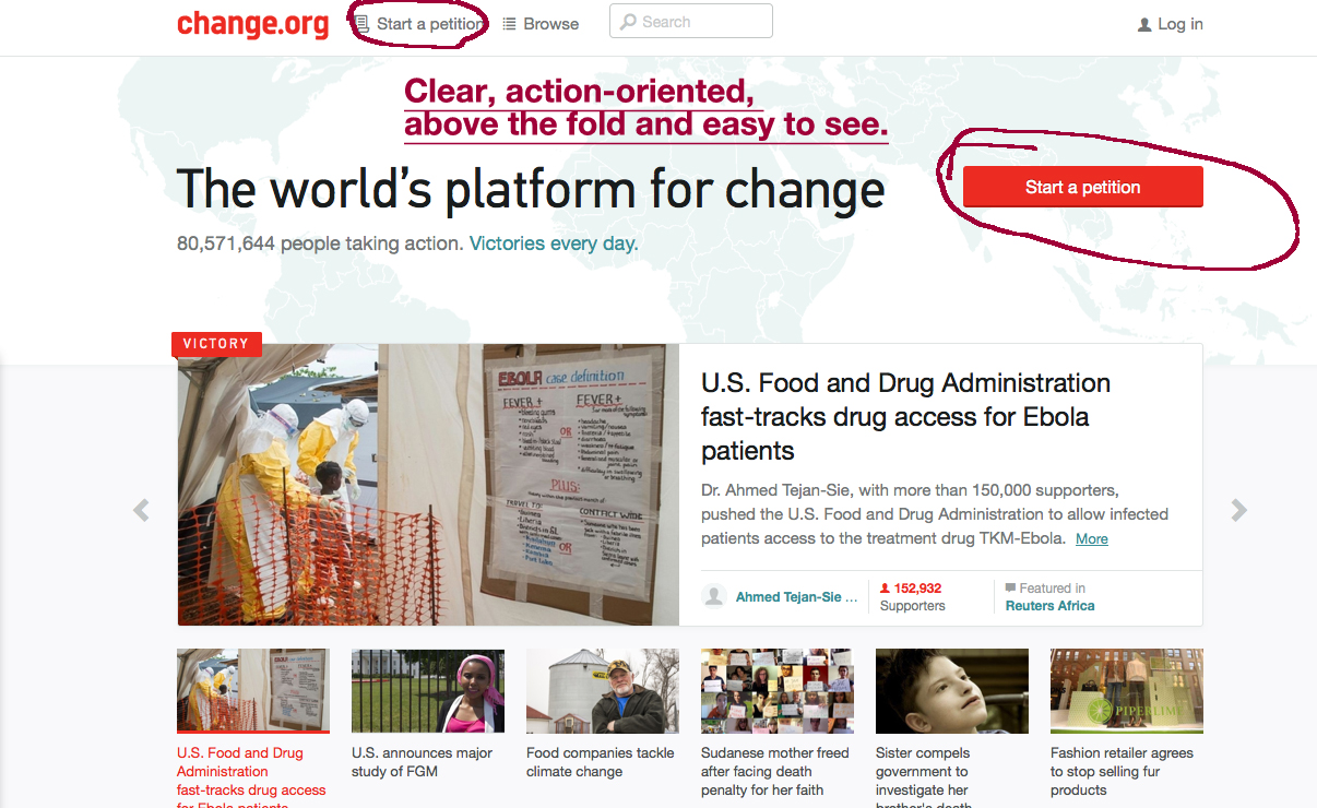
Is the CTA Above the Fold?
In an eye-tracking study investigating website reading behaviors, Nielsen Norman Group found that website visitors spend 80 percent of their attention “above the fold,” meaning on the portion of the webpage that is initially viewable. (Click to tweet!)
Visitors should not have to scroll down to see a call-to-action on a page. In reality, most won’t.
Does the CTA Stand Out?
The CTA needs to be noticeable to be effective. It should be a different color than the surrounding part of the page, and should have white space around it.
Is There Consistency Between the CTA and Landing Page?
Don’t take a chance on confusing the visitor as they move from the CTA to the landing page. It should be obvious that the landing page is for the same offer as the CTA.
The call-to-action and landing page should have the same:
-
Headline
-
Action Verbs
-
Images
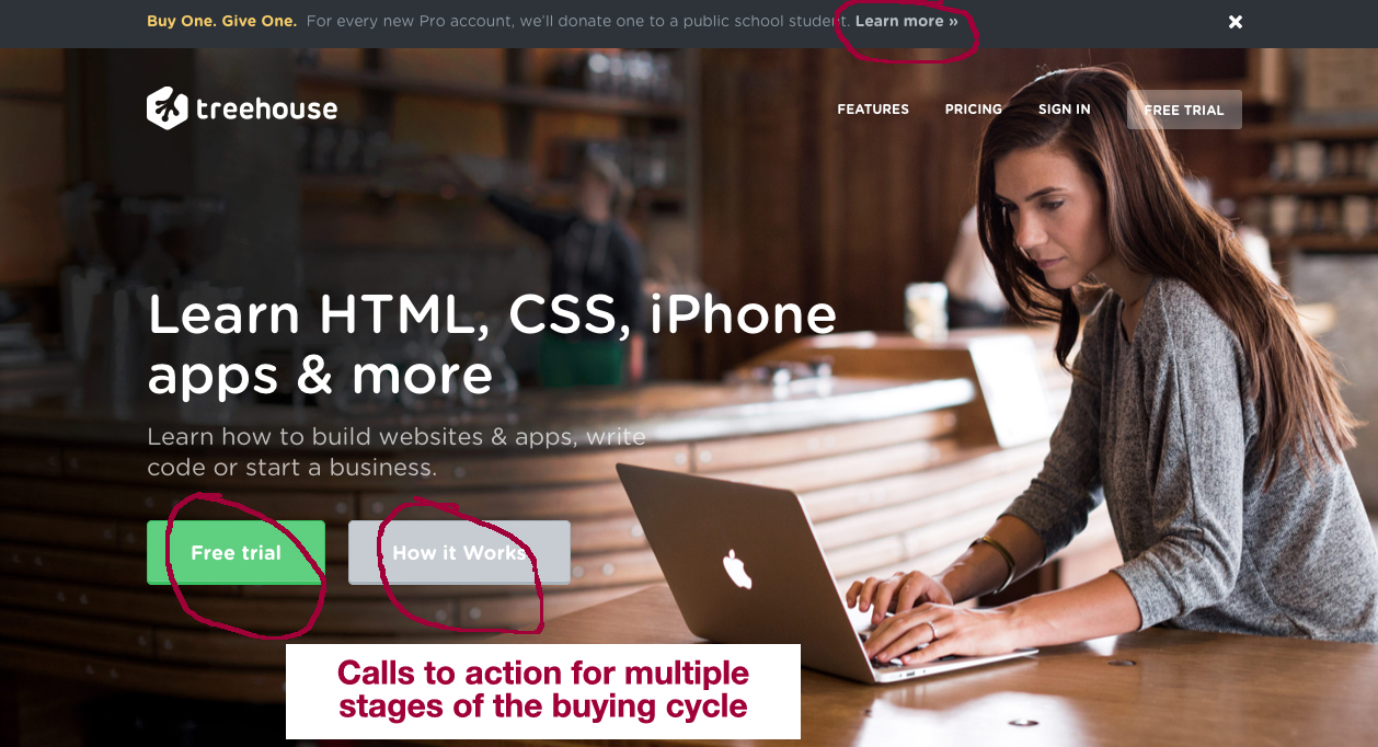
Are There CTAs for Different Stages of the Buying Cycle?
Not all of your website visitors will be at the same stage in the buying cycle. By now, you have (I hope) developed offers for various personas and buying cycle stages:
-
Podcasts and ebooks for top of the sales funnel;
-
Testimonials and product guarantees for middle of the funnel; and
-
Demos and sales proposals for bottom of the funnel.
Be sure all of those various stages are represented in the CTAs on your website. You should have CTAs to match all of your offers.
Does Each Page Have a CTA?
Every page on your website should have at least one CTA that is relevant to the content of that page. Your blog might have offers for ebooks related to the blog topic. Your “About Us” page should have a “Contact Us” CTA. Product pages should have CTAs for a free trial or videos of the product in action.
Your home page should include two or more calls-to-action. These could be in a banner ad across the top, in the side bar, or as a contextual CTA in the text on the page.
How do you think your website stacks up? Our Call-to-Action Report Card assigns each of these criteria a point value. Download it and evaluate your site. Did you use the 7 criteria for evaluating calls-to-action and make the grade?
If not, there are more best practices outlined in our free Comprehensive Guide to Creating & Executing Calls-to-Action.