

Is 2020 the year your company refreshes its online look with an updated website? Or launches a new brand or branding that means building a new site from scratch?
Here are the design trends you’ll want to keep in mind to build an effective website that not only looks great, but performs from the first click.
But before we talk visual design trends, let’s take a step back for a refresher on what truly makes a website effective for inbound marketing. First and foremost, it must be designed to drive conversions.
As Neil Patel notes, up to 96 percent of visitors to your website aren’t ready to buy. That means your website’s chief objective is to convert them into contacts or leads, so that you can build a relationship and remain top of mind until they are ready to make a purchase decision.
In order to facilitate conversions, your website needs a few key components:
-
Content that drives SEO so that prospects find your website when researching their problems and needs.
-
Offers that appeal to visitors, and calls-to-action that promote those offers.
-
Landing pages where visitors access the offers, in exchange for contact information.
-
An automated lead nurturing system to establish and maintain a connection with leads and move them through the sales funnel toward a sale.
All of these are essential for a website to perform as an inbound marketing vehicle to generate leads and facilitate sales, especially in B2B industries or others with a long sales cycle and extended purchase decision timeline. It doesn’t matter how great your website looks (form) if it doesn’t have the tools (function) to capture and nurture online leads.
Having said that, it is also important to have a website that looks modern and is designed in a way that is easy to read and navigate. Here are some of the hottest design trends for 2020 to consider as you plan your website redesign or new website launch:
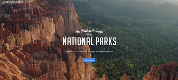
1. Background Video
Moving visuals of different forms and formats have always been popular in web design. The latest trend is the usage of background video. Animation instead of static background brings your platform to life and makes visitors stay longer — or at least long enough to watch the whole video.
The background video is really astonishing on this website: The Hidden Worlds of the National Parks.
In the case of FoodBloggerPro, the switch from a static background to video background increased their conversion rate (the rate at which visitors signed up for an email newsletter) by 138 percent.
But, there are caveats. A few suggestions if you are considering switching to a background video for your website:
-
Have a purpose for your video and be sure it reflects your overall branding and message.
-
Don’t let the video compete with the rest of your website content, especially the CTAs that are needed to encourage conversion.
-
Keep file size and page loading time in mind. Search engines penalize pages that take too long to load. WebsiteBuilderExperts recommends limiting the video to 5-10 seconds long, and the video file size to 6MB or less, then looping the video.
-
Avoid audio that autoplays.
2. Split Content
With the help of split content web design technique, you can showcase more than one important message at a time on a single page. It also makes your website look more appealing and well-organized.
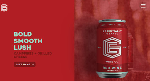
Here is a good example of a successfully implemented split screen layout:
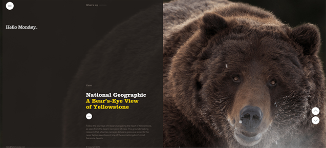
Split screens provide an opportunity to combine a striking image with key text or a call-to-action designed to convert website visitors, or two offer visitors two different experiences with your site.
Do you serve two different geographies, such as North America and Asia? Use a split screen to invite visitors to choose their location. Use something similar if your business serves both consumers and B2B customers.
The split doesn’t have to be symmetrical — it could also feature a narrow vertical element alongside a more horizontal section.
As with any website, be sure to test your site across multiple browsers and platforms — both traditional desktop/laptop browsers and mobile browser. In most cases, a split screen site should stack the sections on the vertical screens of mobile devices, continuing to provide a simple, clean look for your website.
3. Bold Colors
As more brands seek to stand out among a sea of competitors online, more website owners will continue to adopt bold and bright colors. Not only are brilliant and deep colors immersive, but they are also attention-grabbing.
Here’s another example of a split screen design, using bold colors:
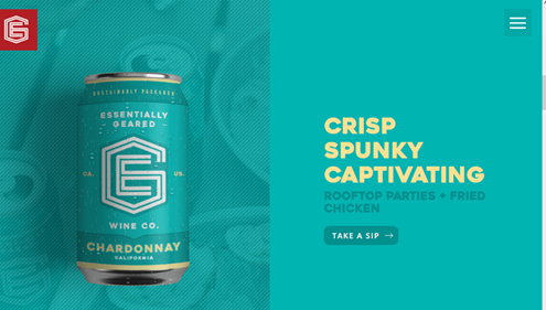
99Designs, a website dedicated to connecting designers to projects, identified 8 color trends for websites in 2020:
1. Glowing neon — think the ‘80s.
2. Transparent color overlays — adding extra layers and dimension
3. Futuristic color schemes — including blues, purples and hot pink.
4. Vintage-inspired palettes with a modern twist — muted colors, but with occasional accents that stand out
5. “Dark mode” color schemes – dark background with text and images contrasting the typical “black on a white background”
6. Unique monochromatic color palettes — the simplicity of black and white, but with the personalization of a signature color used in all shades
7. Colors that carry meaning — used carefully, the emotions and ambience of specific colors can convey a message without saying a word
8. Classic Blue (Pantone’s color of the year 2020) — Pantone says: Instilling calm, confidence, and connection, this enduring blue hue highlights our desire for a dependable and stable foundation on which to build as we cross the threshold into a new era.
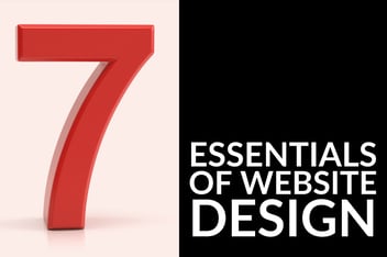
4. Big Typography
One of the latest trends in web design is large typography. In 2020, bigger is better.
Here are three examples of big typography used in web design:
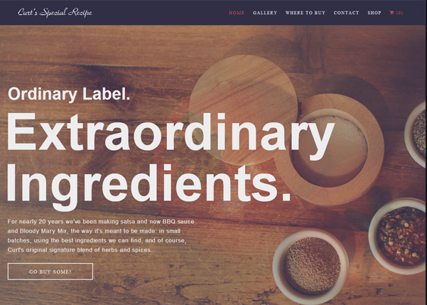

Just as the bold colors mentioned above work to catch the eye and provide an instant impression, large type can do the same for your website. Set the tone with just a few words.
And that is key — if you are going to use mega-sized typography, you have to be concise. Whether you use the oversized text as the main image on your home page, in a unique menu, or as a distinct header for each page of your website, be deliberate about which word (or very few words) you use in this way.
Is your brain spinning now with ideas for your new (or refreshed) business website? Here are a few more things to think about before you take on the project:
Read through those blog posts for more insights into what your business website needs to perform in 2020, and then download our Website Audit Template for a more in-depth way of evaluating your current site and pinpointing what needs to be improved as you create the next one. Not sure how to start? Talk to me — click here to schedule a no-obligation consultation and we can chat about how a new or updated website fits into your overall marketing and business goals.


.jpg?width=352&name=Jones_may_blog_headers_web_design_trends_to_watch%20(1).jpg)

